[This is a work-in-progress document which demonstrates how to create Tufte-like layouts from HTML and CSS. You are currently looking at the HTML version. Try making the window narrow to see how the code hides/shows sidenotes. And, make sure you look at the PDF version. Also, Edward Tufte's original paper books are highly recommended.]
Licensed under the Apache License, Version 2.0 (the License); you may not
use this file except in compliance with the License. You may obtain a copy
of the License at http://www.apache.org/licenses/LICENSE-2.0. Unless
required by applicable law or agreed to in writing, software distributed
under the License is distributed on an as is basis, without
warranties or conditions of any kind, either express or implied. See the
License for the specific language governing permissions and limitations
under the License.
Contents
for Edward R. Tufte, and his statues
for Walter Bender, and his green machine,
for the Prince programmers
Introduction
In 1990, I was a graduate student at the MIT Media Lab, a wonderful playground for programmers, designers, and artists. Most of our work was shown on computer screens. Myself, I spent two years working on a giant cathode-ray tube with a 2k resolution, capable of showing a broadsheet newspaper page.
There were regular talks by invited luminaries. One of them was Edward Tufte. He was invited by my advisor, Walter Bender, who thought highly of him. Tufte's talk was fascinating and the pictures he showed were beautiful.
After the talk, I first confirmed that his last name is, indeed, of Norwegian origin. Then I purchased two of his books. One was The Visual Display of Quantitive Information, the other was the newly issued Envisioning Information. Opening these books is a revelation. Beautiful typography, printed on thick paper, bound by a hard cover. Richly illustrated, with a slew of figures and sidenotes.
When I later started developing Cascading Style Sheets (CSS), computer screens were the main target. But, even from the very first proposal, being able support printed books was a goal. CSS1 did not have the capabilities to create a Tufte-like book, nor did CSS2. But inch by inch, column by column, page by page, CSS has grown up and this document will show how you can start formatting a Tufte-like book yourself.
The CRT from 1990 is probably buried in a landfill somewhere. But the books I brought with me from the lecture are still treasured items on my bookshelf.
Acknowledgements
In 2015 a group of LaTeX enthusiasts reverse-engineered the layout of Tufte's books and created a template for anyone to use. I am grateful for their work and I have borrowed a particularly well-researched chapter from their report.
I am indebted to the Prince programmers who created the formatter which produced the PDF version of this book. CSS has been extended with some new properties and values, the these new features were worked out with the programmers in Melbourne. In particular, Mark Brown and Michael Day have been instrumental adding support for sidenotes in CSS.
Dave Liepmann has done wonderful work with CSS stylesheet which encodes Tufte's designs. While the style sheet used in this document is different, Dave's style sheet is highly recommended for reuse.
Tufte's books are typeset with a classic serif typeface. The first editions were typeset in Montype Bembo, in lead! Later, an electronic font named «ET Book» that closely resembles Bembo was been designed by Dmitry Krasny, Bonnie Scranton, and Edward Tufte. It has been released with a generous license, thank you.
The texts on Maps and Aivazovsky are borrowed from Wikipedia, perhaps the most amazing project to appear on the web.
Finally, I wan to thank Walter Bender, my mentor in typography. He introduced me to Tufte's work. Without Walter, CSS would probably not have been created.
Codex
Edward Tufte's books are beloved for the insight they provide into fascinating topics, and also for their beautiful design. Opening a Tufte book give readers a near-religious experince which, for a moment, restores faith in humanity.
You realize that someone, back in time, has been thinking intelligently about how to represent an important idea. That abstract thinking has been preserved on paper or a canvas. Then Tufte, the Indiana Jones of infographics, has discovered the unknown treasure in a dark and dusty corner of an obscure archive, and carefully reproduced the precious sample.
When opening the book, you can study the thoughtfully placed figure and compare it to other thoughtfully placed figures from other times and places. The similarities cannot be coincidental! There must be a human connection, in a complex web of information!
Through buying the book you have become part of a movement, a discreet network of discerning donors who support Tufte's info-expeditions. As a perk you get to put his books on your shelves where your friends, and perhaps the next generations, may discover them.
Someone will find them, someone will learn, some young person will take their eyes off the phone for a minute and experience the treasures of a paper book. All is no not lost, humanity may still prevail.
After the first infatuation, an urge to analyze sets in. What exactly is it that make these books so compelling? The hard cloth covers? The thick, creamy paper? The classy fonts? The sidenotes?
Some people have meticulously analyzed the books to find answers. A group of Latex enthusiasts has studied the books and published a Tufte template to produce a Tufte-like book.Latex is a computer program used in document preparation. It builds on TeX, an earlier system developed by Donald Knuth to format his seminal book son The Art of Computer Programming. The document you are currently reading is also a template for create a book with a Tufte-like appearance.
Arguably, Prince has a tougher job than browsers as it has to split the manuscript into pages, a process known as pagination. The difference between paged and scrolled presentations may seem trivial; anyone can tear a sheet of paper in two. But that difference has long-standing historical implications.
Scrolled documents came first. Early documents were written on vellum and papyrus, an rolling these into scrolls protected the content. But scrolls are fragild and impractical to transport. When the ancient Romans started cutting scrolls into sheets, transport and storage became easier. Suddenly it was possible to stack books, put them in your travel bag, or store them on shelves. Libraries could be formed.
This invention is known as the codex. A codex, much like the modern book, is bound by stacking pages and binding one edge. While the codex was a consumer-friend format, it was still a rare product due to being handwritten on expensive material. Gutenberg changed that around 1450 years later. His development of an efficient printing press made it economical to publish books and thereby distribute information to many.
Gutenberg's invention transformed Europe. We had the renaissance, the reformation, and the industrial revolution. These changes would not have happened without printed books, and they are sometimes referred to as the «Gutenberg effect». But the changes mostly affected Europe and the west. As such, the world wide web is more ambitious; its name signals a will to tranform the whole world.
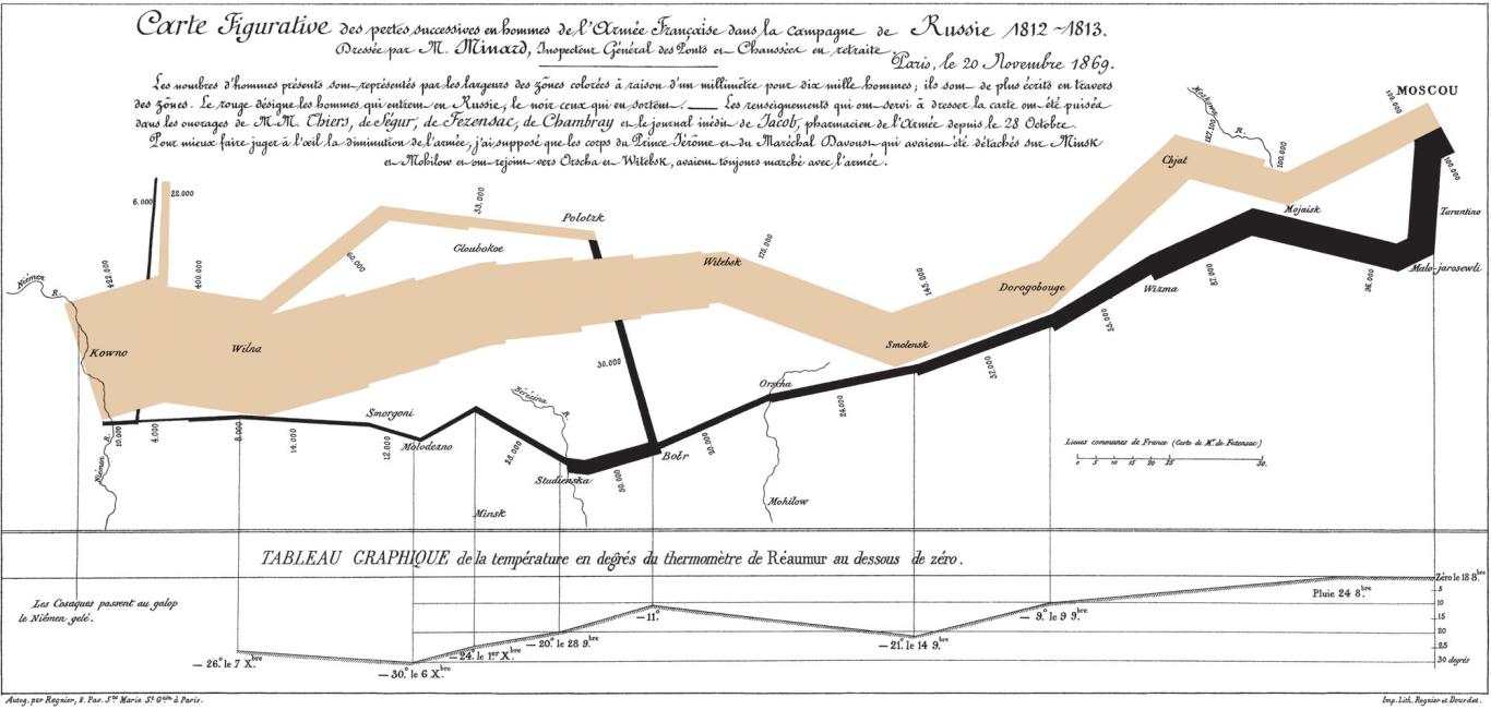
A treatise on Tufte is not complete without the map of Napoleon's ill-fated 1812 campaign in Russia. The illustration was made by Charles Joseph Minard, a French civil engineer known for his work in information graphics. Minard was 31 years old when the Grande Armé crossed into Russia, but thankfully – both for him and us – he had not chosen a military career.
The world wide web is the only invention which can challenge the codex and printing press in terms of impact on our civilization. Still, the web took a step backwards by reintroducing scrolled documents. In web browsers, documents that take up more than a screenful are given a scrollbar to move up and down in the document. This is a convenient solution on computer screens, but an important component is missing: the aestetical experience of browsing a well-desiged book and seeing balanced spreads of pages opening in front of your eyes. If we want future generatsions to have this experience, we must learn to make beautiful books from web content. This doucument describes techniques which may be useful.
Lorem ipsum dolor sit amet, con sectetur adip iscing elit, sed do eius mod tempor in cididunt ut labore et dolore magna aliqua. Ut enim ad minim veniam, quis nostrud exer citat ion ullamco laboris nisi ut aliquip ex ea com modo consequat. Duis aute irure dolor in repre henderit in voluptate velit esse cillum dolore eu fugiat nulla pariatur.
Lorem ipsum dolor sit amet, con sectetur adip iscing elit, sed do eius mod tempor in cididunt ut labore et dolore magna aliqua. Ut enim ad minim veniam, quis nostrud exer citation ullamco laboris nisi ut aliquip ex ea commodo consequat.
Gutenberg is credited with having invented the printing press. But he invented far more than the press itself. He developed oil-based ink, metal tools for casting movable type, and he pioneered an efficient production process for printing documents.
Lorem ipsum dolor sit amet, con sectetur adip iscing elit, sed do eius mod tempor in cididunt ut labore et dolore magna aliqua. Ut enim ad minim veniam, quis nostrud exer citation ullamco laboris nisi ut aliquip ex ea commodo consequat.
The code
[Work in progress]
To follow this guide, you will need some knowledge of HTML and CSS. Also, on your computer you will need a web browser, and a recent version of Prince. The browser formats the HTML and CSS on your screen, be it mobile or stationary. Prince reads the the same files and turns them into a PDF file which can be printed.
Let's start looking at some code. Tufte's books all use the same page size, which is easily expressed in CSS:
@page {
  size: 220mm 264mm;
}
That is, the page is 220 millimeters wide, and 265 millimeters high. If you prefer, you may also use inches or typographic points to express the size. Next is adding page margins:
The four values set the top/left/bottom/right margins, respectively.
Tuba mirum. Lorem ipsum dolor sit amet, con sectetur adip iscing elit, sed do eius mod tempor in cididunt ut labore et dolore magna aliqua.
Lorem ipsum dolor sit amet, con sectetur adip iscing elit, sed do eius mod tempor in cididunt ut labore et dolore magna aliqua. Ut enim ad minim veniam, quis nostrud exer citat ion ullamco laboris nisi ut aliquip ex ea com modo consequat. Duis aute irure dolor in repre henderit in voluptate velit esse cillum dolore eu fugiat nulla pariatur.
Lorem ipsum dolor sit amet, con sectetur adip iscing elit, sed do eius mod tempor in cididunt ut labore et dolore magna aliqua. Ut enim ad minim veniam, quis nostrud exer citat ion ullamco laboris nisi ut aliquip ex ea com modo consequat. Duis aute irure dolor in repre henderit in voluptate velit esse cillum dolore eu fugiat nulla pariatur.
Lorem ipsum dolor sit amet, con sectetur adip iscing elit, sed do eius mod tempor in cididunt ut labore et dolore magna aliqua. Ut enim ad minim veniam, quis nostrud exer citat ion ullamco laboris nisi ut aliquip ex ea com modo consequat. Duis aute irure dolor in repre henderit in voluptate velit esse cillum dolore eu fugiat nulla pariatur.
Lorem ipsum dolor sit amet, con sectetur adip iscing elit, sed do eius mod tempor in cididunt ut labore et dolore magna aliqua. Ut enim ad minim veniam, quis nostrud exer citat ion ullamco laboris nisi ut aliquip ex ea com modo consequat. Duis aute irure dolor in repre henderit in voluptate velit esse cillum dolore eu fugiat nulla pariatur.
Maps
The design and production of maps is a craft that has developed over thousands of years, from clay tablets to Geographic information systems. As a form of Design, particularly closely related to Graphic design, map making incorporates scientific knowledge about how maps are used, integrated with principles of artistic expression, to create an aesthetically attractive product, carries an aura of authority, and functionally serves a particular purpose for an intended audience.
Designing a map involves bringing together a number of elements and making a large number of decisions. The elements of design fall into several broad topics, each of which has its own theory, its own research agenda, and its own best practices. That said, there are synergistic effects between these elements, meaning that the overall design process is not just working on each element one at a time, but an iterative feedback process of adjusting each to achieve the desired gestalt.
Maps of the world or large areas are often either political or physical. The most important purpose of the political map is to show territorial borders; the purpose of the physical is to show features of geography such as mountains, soil type, or land use including infrastructures such as roads, railroads, and buildings. Topographic maps show elevations and relief with contour lines or shading. Geological maps show not only the physical surface, but characteristics of the underlying rock, fault lines, and subsurface structures.
From the last quarter of the 20th century, the indispensable tool of the cartographer has been the computer. Much of cartography, especially at the data-gathering survey level, has been subsumed by Geographic Information Systems (GIS). The functionality of maps has been greatly advanced by technology simplifying the superimposition of spatially located variables onto existing geographical maps. Having local information such as rainfall level, distribution of wildlife, or demographic data integrated within the map allows more efficient analysis and better decision making. In the pre-electronic age such superimposition of data led Dr. John Snow to identify the location of an outbreak of cholera. Today, it is used by agencies of humankind, as diverse as wildlife conservationists and militaries around the world.
This map from around 1710 shows the Norwegian coastline stretched out to fit a long and narrow sheet.
Lorem ipsum dolor sit amet, con sectetur adip iscing elit, sed do eius mod tempor in cididunt ut labore et dolore magna aliqua. Ut enim ad minim veniam, quis nostrud exer citat ion ullamco laboris nisi ut aliquip ex ea com modo consequat. Duis aute irure dolor in repre henderit in voluptate velit esse cillum dolore eu fugiat nulla pariatur.
Lorem ipsum dolor sit amet, con sectetur adip iscing elit, sed do eius mod tempor in cididunt ut labore et dolore magna aliqua. Ut enim ad minim veniam, quis nostrud exer citat ion ullamco laboris nisi ut aliquip ex ea com modo consequat. Duis aute irure dolor in repre henderit in voluptate velit esse cillum dolore eu fugiat nulla pariatur.
Lorem ipsum dolor sit amet, con sectetur adip iscing elit, sed do eius mod tempor in cididunt ut labore et dolore magna aliqua. Ut enim ad minim veniam, quis nostrud exer citat ion ullamco laboris nisi ut aliquip ex ea com modo consequat. Duis aute irure dolor in repre henderit in voluptate velit esse cillum dolore eu fugiat nulla pariatur.
Lorem ipsum dolor sit amet, con sectetur adip iscing elit, sed do eius mod tempor in cididunt ut labore et dolore magna aliqua. Ut enim ad minim veniam, quis nostrud exer citation ullamco laboris nisi ut aliquip ex ea commodo consequat.
Lorem ipsum dolor sit amet, con sectetur adip iscing elit, sed do eius mod tempor in cididunt ut labore et dolore magna aliqua. Ut enim ad minim veniam, quis nostrud exer citat ion ullamco laboris nisi ut aliquip ex ea com modo consequat. Duis aute irure dolor in repre henderit in voluptate velit esse cillum dolore eu fugiat nulla pariatur.
Lorem ipsum dolor sit amet, con sectetur adip iscing elit, sed do eius mod tempor in cididunt ut labore et dolore magna aliqua.
Lorem ipsum dolor sit amet, con sectetur adip iscing elit, sed do eius mod tempor in cididunt ut labore et dolore magna aliqua. Ut enim ad minim veniam, quis nostrud exer citat ion ullamco laboris nisi ut aliquip ex ea com modo consequat. Duis aute irure dolor in repre henderit in voluptate velit esse cillum dolore eu fugiat nulla pariatur.
Lorem ipsum dolor sit amet, con sectetur adip iscing elit, sed do eius mod tempor in cididunt ut labore et dolore magna aliqua. Ut enim ad minim veniam, quis nostrud exer citat ion ullamco laboris nisi ut aliquip ex ea com modo consequat. Duis aute irure dolor in repre henderit in voluptate velit esse cillum dolore eu fugiat nulla pariatur.
The Design of Tufte's Books
The pages of a book are usually divided into three major sections: the front matter (also called preliminary matter or prelim), the main matter (the core text of the book), and the back matter (or end matter).
The front matter of a book refers to all of the material that comes before the main text. The following table from shows a list of material that appears in the front matter of The Visual Display of Quantitative Information, Envisioning Information, Visual Explanations, and Beautiful Evidence along with its page number. Page numbers that appear in parentheses refer to folios that do not have a printed page number (but they are still counted in the page number sequence).
Books
Page content
VDQI
EI
VE
BE
Blank half title page
(1)
(1)
(1)
(1)
FrontispieceThe contents of this page vary from book to book. In VDQI this page is blank; in EI and VE this page holds a frontispiece; and in BE this page contains three epigraphs.
(2)
(2)
(2)
(2)
Full title page
(3)
(3)
(3)
(3)
Copyright page
(4)
(4)
(4)
(4)
Contents
(5)
(5)
(5)
(5)
Dedication
(6)
(6)
(6)
7
Epigraph
–
–
(8)
–
Introduction
(7)
(9)
(9)
9
The design of the front matter in Tufte's books varies slightly from the
traditional design of front matter. First, the pages in front matter are
traditionally numbered with lowercase roman numerals (e.g., i, ii, iii,
iv,...). Second, the front matter page numbering sequence is usually
separate from the main matter page numbering. That is, the page numbers
restart at 1 when the main matter begins. In contrast, Tufte has
enumerated his pages with arabic numerals that share the same page counting
sequence as the main matter.
There are also some variations in design across Tufte's four books. The
page opposite the full title page (labeled frontispiece in the above
table) has different content in each of the books. In VDQI, this page is
blank; in EI and VE, this page holds a frontispiece; and in BE, this
page contains three epigraphs.
The dedication appears on page 6 in VDQI (opposite the introduction), and
is placed on its own spread in the other books. In VE, an epigraph shares
the spread with the opening page of the introduction.
None of the page numbers (folios) of the front matter are expressed except in
BE, where the folios start to appear on the dedication page.
The full title page of each of the books varies slightly in
design. In all the books, the author's name appears at the top of the
page, the title it set just above the center line, and the publisher is
printed along the bottom margin. Some of the differences are outlined in
the following table.
Feature
VDQI
EI
VE
BE
Author
Typeface
serif
serif
serif
sans serif
Style
italics
italics
italics
upright, caps
Size
24 pt
20 pt
20 pt
20 pt
Title
Typeface
serif
serif
serif
sans serif
Style
upright
italics
upright
upright, caps
Size
36 pt
48 pt
48 pt
36 pt
Subtitle
Typeface
–
–
serif
–
Style
–
–
upright
–
Size
–
–
20 pt
–
Edition
Typeface
sans serif
–
–
–
Style
upright, caps
–
–
–
Size
14 pt
–
–
–
Publisher
Typeface
serif
serif
serif
sans serif
Style
italics
italics
italics
upright, caps
14 pt
14 pt
14 pt
14 pt
The tables of contents in Tufte's books give us our first
glimpse of the structure of the main matter. The Visual Display of Quantitative Information is split into two
parts, each containing some number of chapters. His other three books only
contain chapters---they're not broken into parts.
Typefaces
Tufte's books primarily use two typefaces: Bembo and Gill Sans. Bembo is used
for the headings and body text, while Gill Sans is used for the title page and
opening epigraphs in \BE.
Neither Bembo nor Gill Sans are freely available on the web, but there are good-looking alternatives. This document uses
Cabin and
Crimson Pro.
In addition, the Bera Mono typeface is used for
monospaced type.Editor's note: The font situation has improved since this chapter was published in 2015. In this imprint, ET Book is used for the body font, and PT Mono is used for monospaced fonts
The following font sizes are defined by the \TL classes:
Headings
Tufte's books include the following heading levels: parts, chapters, sections, subsections, and paragraphs. Not defined by default are: sub-subsections and subparagraphs.
Sidenotes
Sidenotes carry much of the information in Tufte's books. Chapters have a sidenote area to the right of the main column. Figures in the sidenote area are a maxium of 52mm wide. Textual notes appear in ragged right with a maxium width around 55mm. The result is an optical alignment where the average line length is around the same as the maximum width of figures.